
Responsive design ensures your website displays well on mobile devices and a variety of small screen shapes.
We are one of the most experienced responsive website design companies in Canada. We specialize in beautiful, simple, custom designs for individuals and small companies, as well as high-functionality websites for organizations that employ membership databases, payment gateways and directories. US companies save almost 30% with our Canadian rates.
How good does your site look on cell phones and tablets?
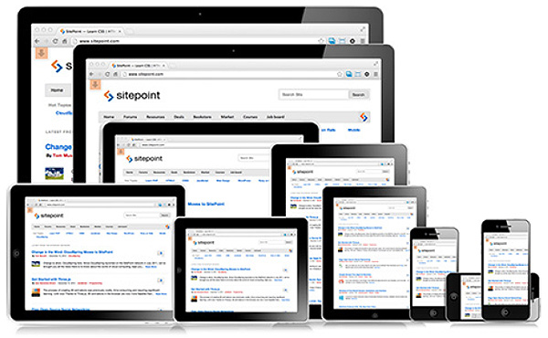
This excellent graphic from Sitepoint shows a few of the possible screen sizes and shapes

How it works
A responsive layout will adjust to fit your screen size – no matter what mobile device you have. The content also reorganizes itself when you turn the device horizontally or vertically.
For example, if an iPad or iPhone is held sideways then turned vertically, the content of a responsive site design will adapt its layout to fit the new format. The effect is often like a collapsing house of cards as one section neatly moves down and relocates under the previous one.
As a result, a website is no longer a series of pages designed to be read at a certain size in a certain position, but something fluid and dynamic that changes with the connecting device.
Example of a responsive layout
The example to the right shows how the responsive site design we created for www.fionaraven.com displays on a cell phone display.
The original heading and logo have sized down and centered themselves. The menu, which goes across the top of the site on a desktop monitor display, has become a drop-down menu.
The sub-menu – located on the right side of a desktop monitor display – has changed location and moved under the content.
The sub-menu is followed by two graphic widgets for “Prices” and “Quote”. These originally appeared in the right sidebar of the desktop display.
Finally the four footer sections appear, one below the other, taken from left to right from the original desktop display.
Converting to a responsive design
We have extensive experience developing responsive websites. Let us show you how different layouts and designs will adjust themselves to fit any screen size or shape.
If having your website display properly on mobile devices is important to you, ask us about converting your HTML site to a responsive WordPress design today.
We may be able to rebuild your current WordPress site in a responsive design while maintaining your existing pages and posts.
Call 778-244-8102 for more information and a helpful discussion.